The Future of Online Giving: Trends and Techniques from the Latest Donation Page Examples


As a nonprofit organization, you likely rely heavily on donations to fund your programs and support your mission. In today’s digital age, donation pages have become an essential component of nonprofit fundraising efforts, allowing organizations to reach a wider audience and accept online donations. However, not all nonprofit donation pages are created equal, and some may be more effective than others in generating donations and engaging supporters. In this blog, we’ll explore the importance of donation pages for nonprofits and provide insights into how your organization can optimize your donation pages to achieve fundraising success. Plus, we have a few stellar nonprofit donation page examples to inspire you as you create new pages or build on your existing ones!!
From donation page design and layout to messaging and calls-to-action, we’ll cover the key elements of a successful nonprofit donation page that can help your organization exceed your fundraising goals and make a positive impact in your community.


How to Build a Nonprofit Landing Page that Drives Action
Watch this on-demand webinar to learn how to secure more funds through your donation page
Why Does Your Organization Need an Online Donation Page?
Donation pages have become an integral part of the modern nonprofit landscape, providing organizations with a convenient and effective way to collect donations and raise funds online. Online giving has continued to grow in popularity in recent years (by over 20% year over year), with donors increasingly looking for easy and secure ways to support their favorite causes.
Online donation pages are critical for your nonprofit for several reasons:
Expanded Reach
Online donation pages allow nonprofits to reach a wider audience of potential donors, including those who may not be able to attend events or fundraisers in person.
Convenience
Online donation pages provide a convenient and secure way for supporters to make donations at any time, from anywhere in the world. This is particularly important for donors who may live in a different location or time zone than the nonprofit they wish to support.
Mobile Optimization
Many online donation pages are optimized for mobile devices, which is important given the increasing number of people who access the internet via smartphones and tablets. In fact, 28% of online gifts in 2022 were made on a mobile device. Having a donation page that is mobile-friendly will ensure that your donors are able to give at their convenience using their preferred device.
Cost-Effective
Online donation pages are often a cost-effective way for nonprofits to fundraise, as they eliminate many of the expenses associated with traditional fundraising methods such as printing and mailing donation forms, manual donor data entry, and offline receipting practices.
Relationship Building
Online donation pages can also help you build stronger relationships with donors by providing opportunities for personalized messaging, donor recognition, and ongoing communication.
By fostering strong relationships with donors, you can get recurring donations, increase the likelihood of repeat donations and build a loyal base of supporters who are committed to your mission and goals.
In addition to the above, lack of online donation forms could also mean that your organization is not reaching an entire generation of donors. Millennials and Gen Z donors have grown up with technology and are highly accustomed to conducting transactions online. As a result, they are more likely to give online than through traditional methods such as check or cash.
What are the Key Elements of a Donation Page?
Not all donation pages are created equal, and some may be more effective than others in generating donations and engaging supporters. Let’s explore the key elements of a successful donation page for nonprofits, including design, messaging, calls-to-action, and more.
By understanding what makes a great donation page, you can optimize your pages and donation form to drive more donations and build stronger relationships with their donors.
Mission Statement
You can’t assume that potential donors have made it to your donation page via the homepage of your website; there are all kinds of other paths, including links that lead directly to your donation page. This often leaves nonprofits asking themselves what to write on a donation page.
So, since you can’t count on visitors seeing your mission statement, it’s a good idea to add it to your donation page to remind supporters of the impact you make or will be making with the help of their contributions.


Craft The Perfect Mission Statement For Your Nonprofit
Use this template to write a mission statement that keeps your team aligned and motivates your supporters to commit to your nonprofit’s cause.
Clear Branding
Having clear and consistent branding on your online donation page is crucial for establishing trust and credibility with potential donors. When a donation page displays your nonprofit’s logo, colors, and other branding elements, it can help reinforce your nonprofit’s identity and communicate its values to supporters.
Additionally, consistent branding across all fundraising materials can help build brand recognition and loyalty, encouraging donors to return and make future contributions. Keela’s donation forms are the best way to easily create branded donation pages that will ensure your donors are confident that their transaction is safe.
The Donation Form Itself
The actual donation form itself (ie. the part where your donor enters their information) is the most critical part of the donation page. Your donation form should be easy to use, donor-centric, and clearly define the information your donor should be entering.
It’s critical that your donation form is optimized: secure, and well-designed, similar to those offered by Keela. And don’t hide it away at the bottom—make it the centerpiece of your page.
Call to Action
A call-to-action is a brief statement that incites and encourages your audience to take the next step and make a donation. It is most often found on the donate button on your donation form.
Your Call to Action is the final ask before a donor decides to commit, so it’s very important to your success. It should be short, to the point, and create a sense of urgency. For example, “Give” is fine, but “GIVE NOW” is much better. For more examples of Call-to-Actions for Nonprofits, check out this post from Constant Contact.
10 Donation Page Best Practices
Now that you have a rough idea of what needs to be included on your donation page, here are some tips on how to make sure it all fits together properly to capture those sweet, sweet donations.
1. Keep It Simple
Don’t overwhelm your donors with information on your donation page. Instead, include just enough information about your nonprofit organization so that they are encouraged to give. Remember that less scrolling is better (no one should have to search for your donation form), so be as concise as possible and use a condensed layout.
2. Be Consistent with Your Brand
Your donation page design should match the style and feel of your website, with congruent logos, colors, fonts, and any other branding elements that are used consistently across your organization’s materials.
3. Share an Impact Story
A great story can do more to connect with your audience on an emotional level than any amount of nonprofit marketing messaging. So, include an impact story that shares how contributions to your organization will make a difference. And if you have access and permission, consider adding quotes or a testimonial from your community.
Donors also like to be able to select the cause area that they are donating too. Keela’s donation pages allow you to set that up so that your donors can choose what’s important to them while making their donation.
4. Give the Option to Become a Recurring Donor
Always include a visible and easy-to-choose option to make a donation recurring on your donation form. Usually, either a checkbox with a short statement beside it or a toggle button is the best way to include this option. Monthly revenue was found to increase by 40% when donors are given the option to make recurring gifts or automatically give again.
Recurring donors are the safety net of your organization, so having recurring giving prompts is critical. Even better, Keela’s forms include a pop-up that asks your donors to make a slightly smaller donation than they were planning, but to make it recurring instead of one-time, allowing you to grow your recurring giving stream!
5. Make it Mobile-Friendly
We’ve said it once and we’ll say it again, mobile-friendly is essential for every webpage, not just your donation page. But you need to ensure that your donation page looks good on a smartphone screen.
You can test your website and forms to check if they are mobile-accessible, or if you’re already a Keela user, you can skip this step because Keela’s donation forms are automatically mobile-friendly.
6. Make it Accessible
When designing your donation page, be sure that it is accessible to people with disabilities, such as visual impairment. Use appropriate color contrast to ensure text can be read, and include text captions for non-text items like photos, video, or audio. The best donation pages are accessible to everyone!
7. Optimize Your Donation Form
Specific to your donation form itself, make sure it has been optimized with the appropriate fields, categories, and details to help you secure more donations. And remember that asking for too much information can sometimes hurt you more than it helps you!
8. Promote matching gifts
One of the easiest ways to double your fundraising revenue is by providing matching gifts. Most corporations have programs that promise to match donations given by their employees.
For instance, if an employee donates $200 to a particular cause, their company would match that donation. That means the nonprofit would receive $400 in total.
Some corporate giving programs even go beyond the 1:1 match, offering 1:2 or more. That means they’ll give double the amount employees donate to various nonprofits.
Also, did you know that one in three donors say they’d donate more if their donations were match-eligible? And between $2 and $3 billion in donations are collected via matching gift programs?
Keela’s integration with Double the Donation makes securing matching gifts easy by allowing donors to search for their company right in the form and see if they offer matching donations for their employees.
9. Add visuals to your donation page
Adding visuals to a web design is one of the most effective ways to boost engagements. In addition to keeping users engaged, the right visuals will also help you communicate your message better. It’s why most websites, from B2B company blogs to personal blogs, incorporate images, videos, and infographics into their content.
So think about your nonprofit’s mission and use the correct visuals that align with it. It will also help if you use real images captured by your team.
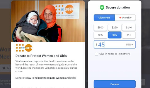
But for the best results, you want to go for visuals that add value. Therefore, add images that align with your nonprofit’s mission. For example, if your nonprofit is centered around helping women or young girls, it would make sense to use images of some women or girls you’ve helped.
10. Provide suggested donations amount
Suggested donations can help you collect more from your donation page. How? For one, it simplifies the donation giving process. The donor just needs to click a button with the suggested donation amount instead of entering the amount manually.
Secondly, it gives donors an idea of how much they should donate. For example, if you place three suggested donation amounts, donors will automatically know how much you expect. Not only that, but they’ll also get an idea of how much other donors are giving.
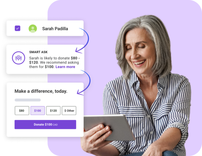
There are very few donation forms on the market that can tailor an ask to each individual donor, Keela is one of them. Keela’s Smart Ask feature takes into account giving history, demographic information and wealth indicators to create a custom ask for every donor that lands on your donation page.

Therefore, it’s advisable to track your donation amounts. That should be straightforward if you’re using robust donation software, as it’ll track the metric automatically. Keep an eye on the average donations and adjust your suggested amounts accordingly.
With that said, you should also provide the custom amount option. This is still critical for the occasional donor who may want to give lower or higher than the suggested amount.
5 Donation Page Examples to Inspire You
1. Happy Jack Cats

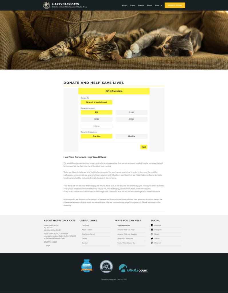
This Idaho-based nonprofit organization works to rescue cats and reduce the feral population through spaying and neutering. We love their page for its consistent branding, the touching story they tell, and the fact that their donation form is the first thing on the page. Happy Jack Cats saw a 12% increase in donation revenue in their first year using this donation page and Keela form.
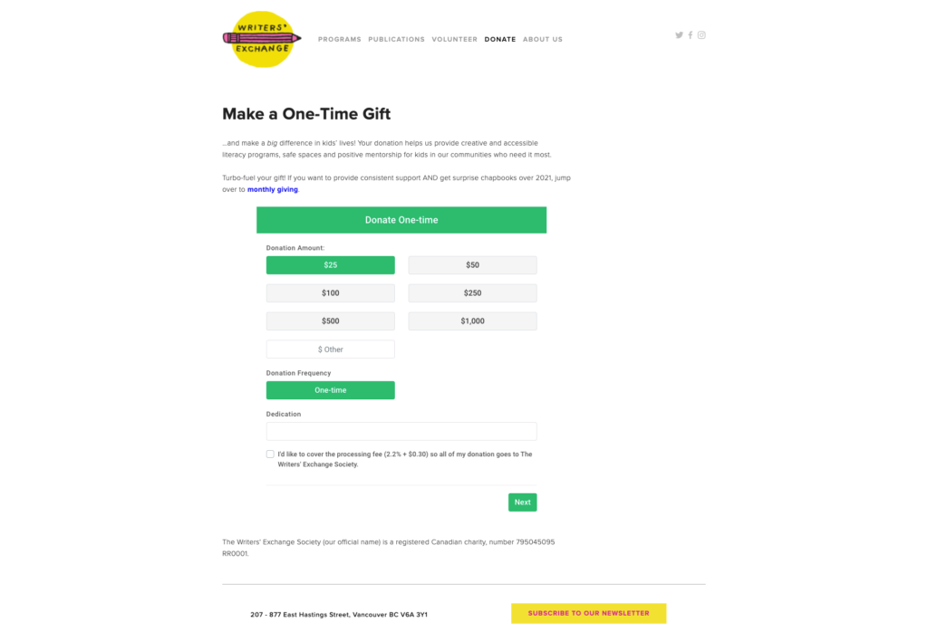
2. Writers’ Exchange
This Vancouver nonprofit organization helps under-resourced kids learn to read and write. We love their donation page because it restates their mission right off the bat, no need to visit their homepage. Plus, their donation form is upfront and easy to navigate, and they provide a link to give monthly.
The Writers’ Exchange saw a 7% increase in donation revenue in their first year using this donation page layout and Keela form. The Canada Revenue Agency also paid them compliments on their well-organized tax receipts, which are automatically generated by Keela.
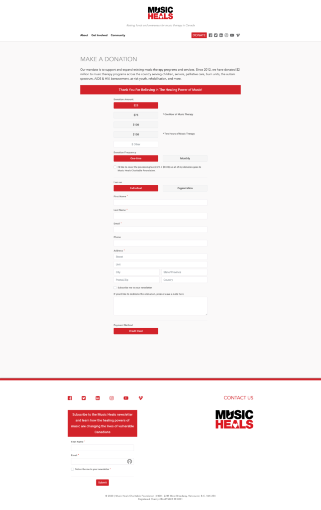
3. MusicHeals
Vancouver-based MusicHeals raises funds and awareness for music therapy programs. And their donation page ticks all the boxes: solid and consistent branding, mission statement, a detailed but expertly laid out donation form that is easy to find, and an option to become a recurring donor, plus they managed to sneak in a checkbox to become a newsletter subscriber, which is a nice bonus.
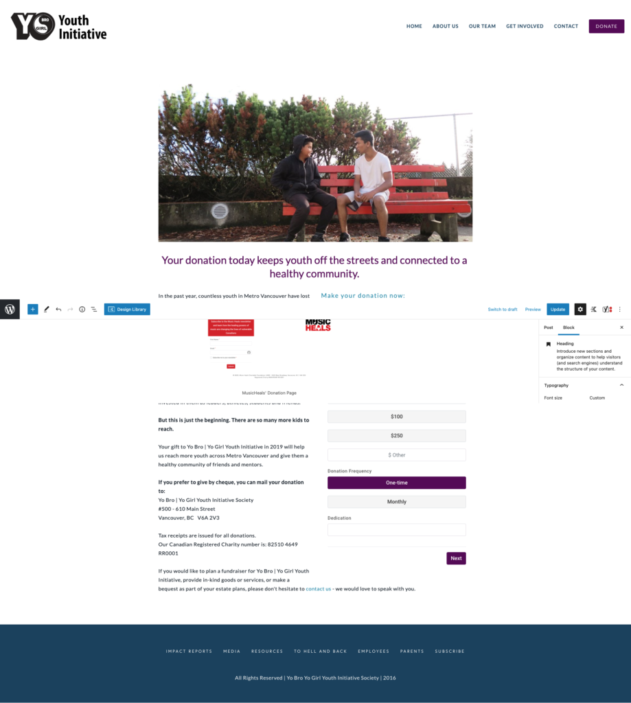
4. Yo Bro Yo Girl
Yo Bro Yo Girl Youth Initiative endeavors to reach youth at risk of gang violence and the opioid crisis. Their donation page does a great job explaining their mission while using their overall brand and a photo to build an emotional connection with potential donors.
They also suggest becoming a recurring donor and show their charity registration number upfront to build trust. YBYG saw a 49% increase in donation revenue in their first year using this donation page and Keela form.
5. Fresh Roots
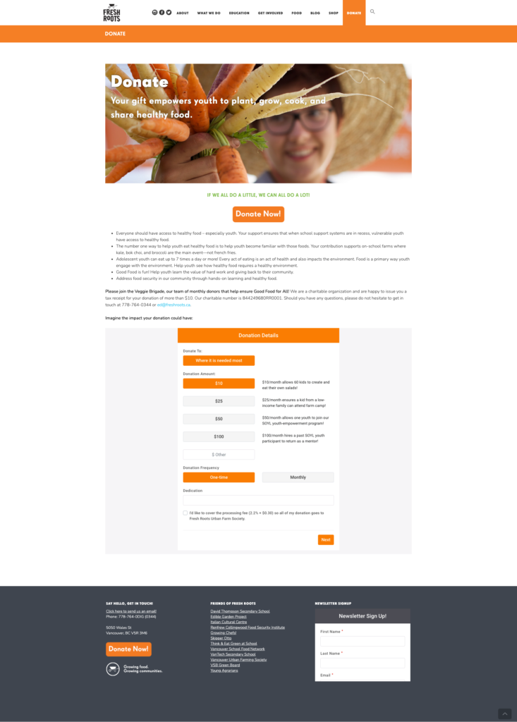
This incredible nonprofit organization works with kids to help them grow and cook healthy food. And their branding is excellent, so they make good use of it on their donation page. They also explain their mission and explain how your donation will be used to make a positive impact.
Their online donation form also offers the option to become a recurring donor, and they display their charity number to build trust with donors. Fresh Roots saw a 48% increase in donation revenue in their first year of using Keela.
Conclusion
In conclusion, creating an effective donation page is crucial for any non-profit organization looking to increase their fundraising efforts. By following best practices such as clear calls to action, easy-to-use forms, and personalized messaging, non-profits can create donation pages that resonate with their supporters and encourage them to give generously. Including essential elements such as donation amount options, recurring donation prompts and impact messaging can also help increase donor confidence and inspire more donations. By studying examples of successful donation pages and incorporating these best practices and essential elements, you can create donation pages that inspire and motivate supporters to give, ultimately leading to greater impact and success in your organization’s mission.
Ready to Start Raising More Through Your Donation Forms?
Get a glimpse of how Keela helps nonprofits to create custom, unlimited, and donor-centric donation pages using Keela’s form builder.


